

ABCDESIGN is a Hong Kong-based design and branding studio. We provide a full range of design services specialized in branding, identities, event identity, marketing strategy, packaging, print, publications, and website design. We also offer solutions for photography and videography services. We believe our passion and creativity will bring energy to our clients.
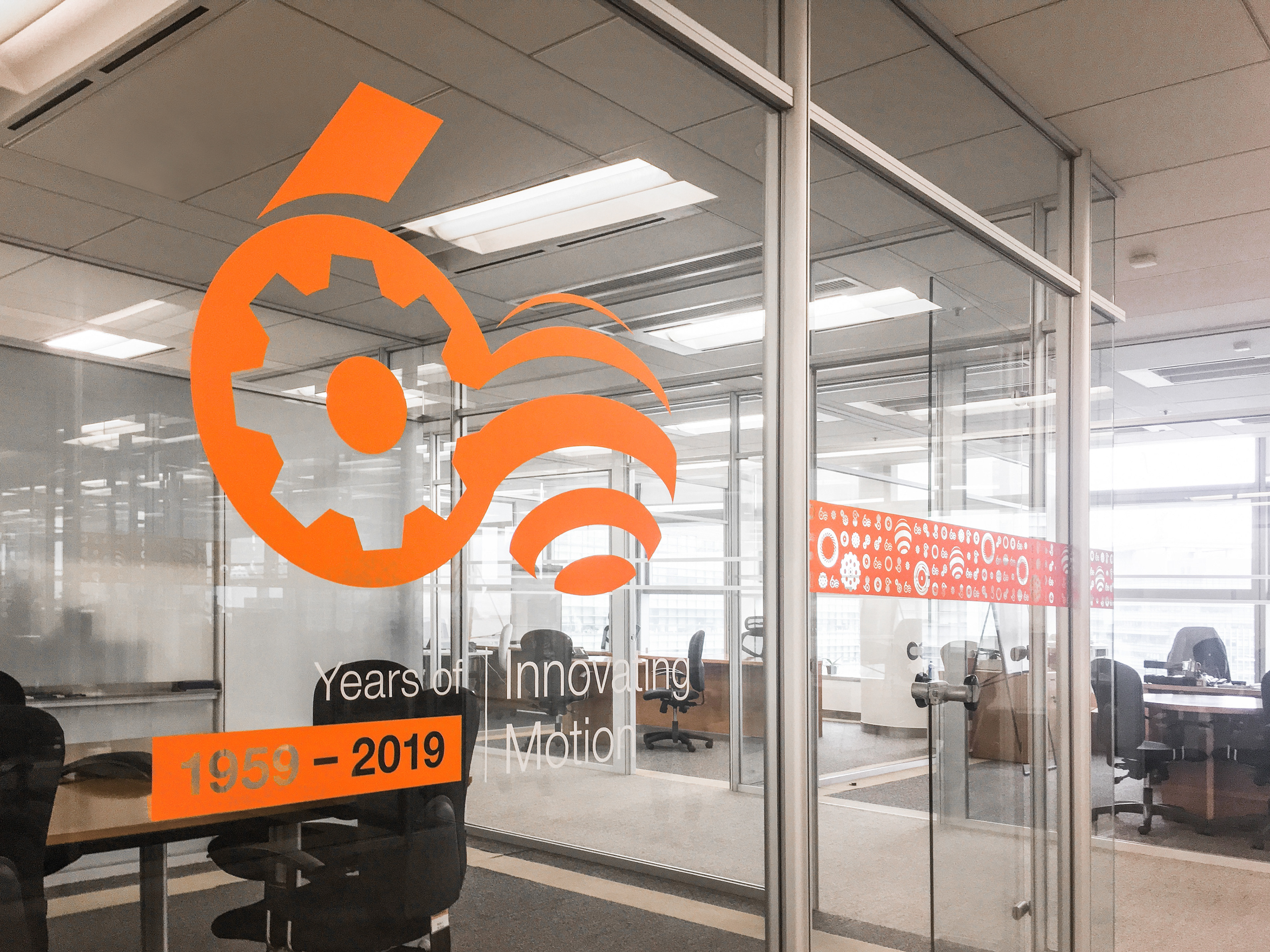
Johnson Electric 60th Anniversary

Lion 40th Anniversary
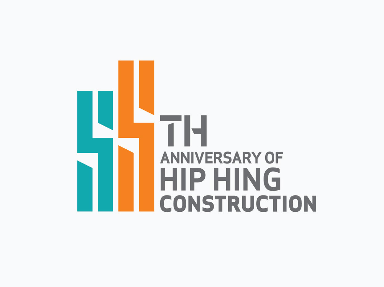
Hip Hing Construction 55th Anniversary
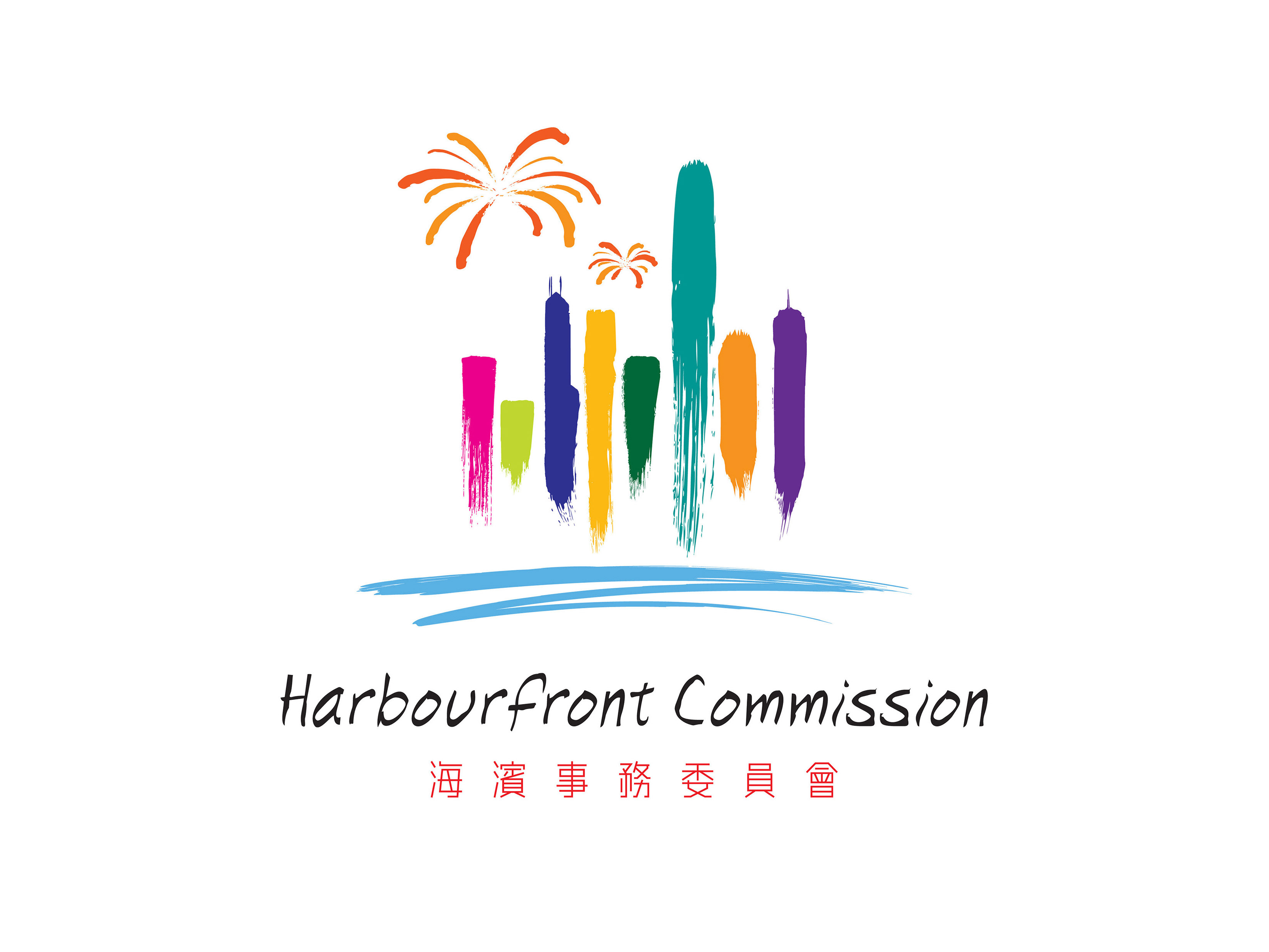
Harbourfront Commission

Voguish Fashion

Pine Construction Engineering
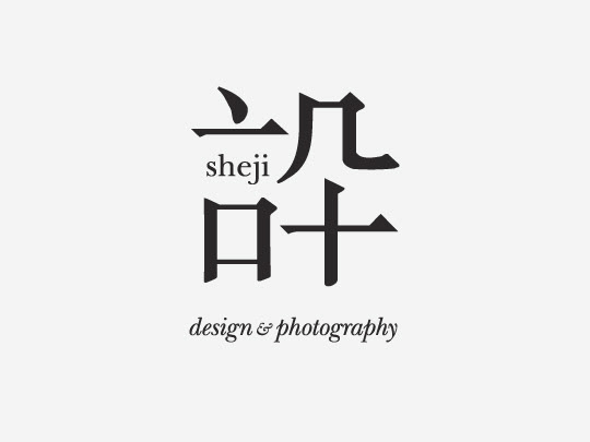
Sheji
T.O.T. Strategic Management

Delicious

Alpha Logistics