
T.O.T. Strategic Management
Corporate Identity Design
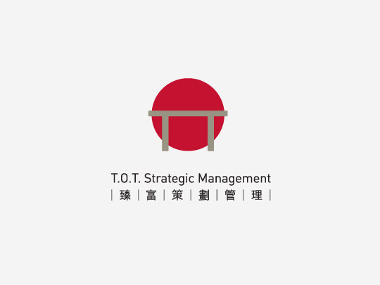
We were asked to design the corporate identity of T.O.T. The logo itself is a conceptual picture of a sunrise. The “fence” consists of two “T”s, and the “sun” is actually the “O”. They become “TOT” together which implies it is a strong, good prospective company in the field.