

ABCDESIGN is a Hong Kong-based design and branding studio. We provide a full range of design services specialized in branding, identities, event identity, marketing strategy, packaging, print, publications, and website design. We also offer solutions for photography and videography services. We believe our passion and creativity will bring energy to our clients.
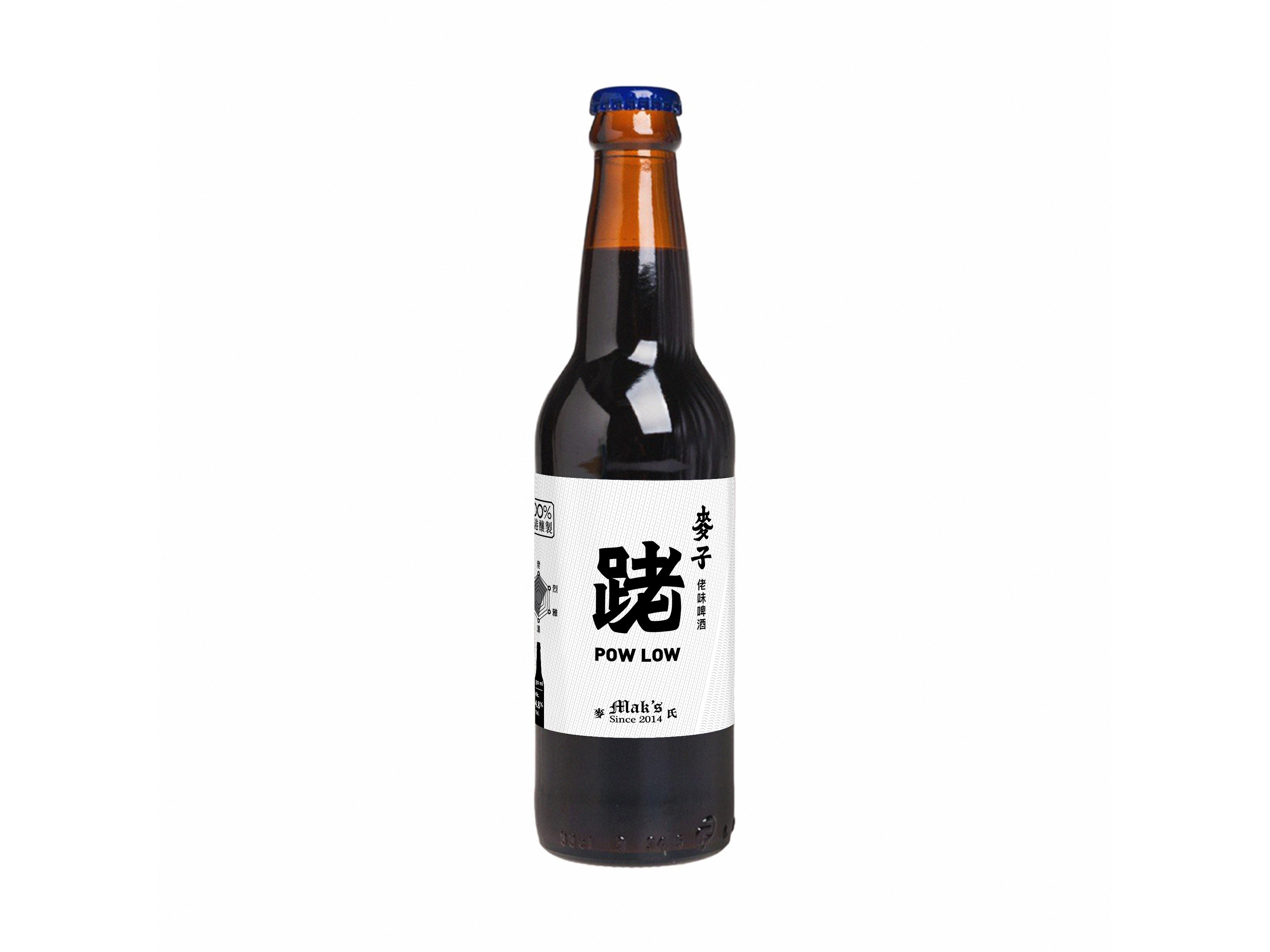
Pow Low Race
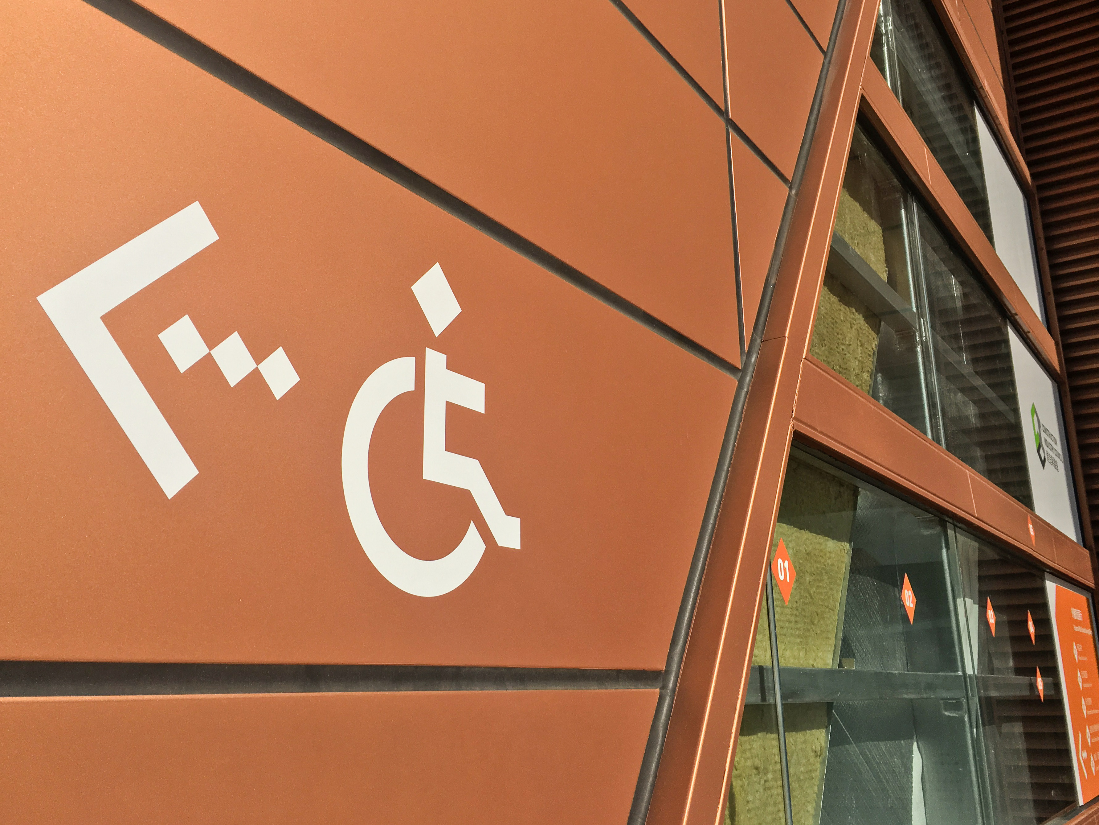
Construction Industry Council - MIC Display Centre
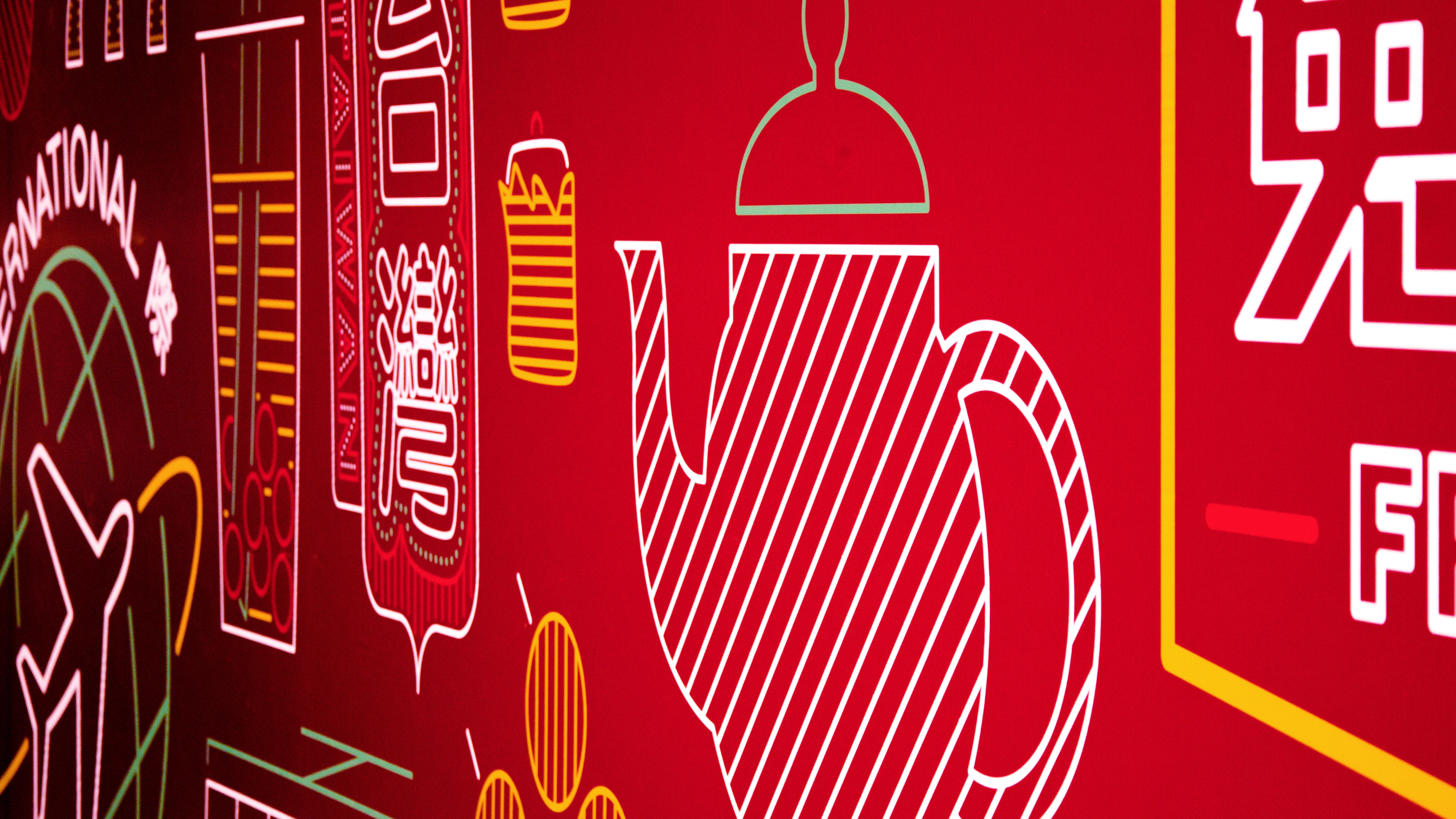
Good Goods Show 2016
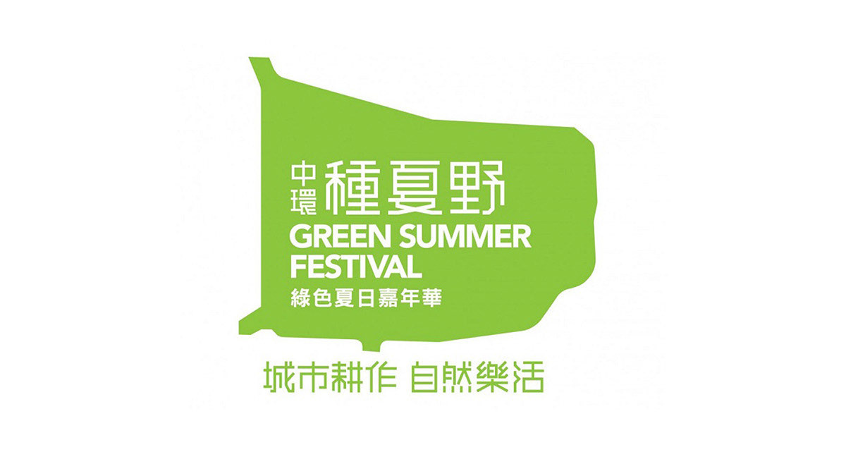
Green Summer Festival

Pow Low 4x25km Relay Race